
HettyKet
-
Posts
293 -
Joined
-
Last visited
-
Days Won
2
Content Type
Profiles
Forums
Blogs
Interviews
Gallery
Store
Events
Everything posted by HettyKet
-
In this thread, we commiserate about healing our fresh tattoos.
HettyKet replied to Pugilist's topic in Tattoo After Care
They say it takes 3 months for colour to show absolutely true. I've plenty of full colour tattoos and experience has shown that to be about right, for me at least. You'll be able to get a better idea of the final shade after a few weeks though, once the tattoo is under the skin rather than on it, IYSWIM. The changes are subtile after that so you might not notice any further change on something that's just line work. Any chance of a photo @Pier0445? -
I've not been getting tattooed for that long, 2 and a half years or so. Had about a year of (mostly) monthly appointments which was lovely, but it's been 4 to 6 months between times since then which feel like huge periods of waiting. So, in an ideal world of unlimited money and free choice of appointments, I'd love another year or two (or three) of monthly sessions outside the summer months. Same here. Feels like it helps them retain their power or something.
-
Ooh, @Synesthesia I forgot this one the other day. No idea how. I love it.
-
New member, First tat - healing and hockey question
HettyKet replied to Zendrix9's topic in Initiation
Oh, and welcome! Sorry. -
New member, First tat - healing and hockey question
HettyKet replied to Zendrix9's topic in Initiation
I'd not play either. It'd probably be fine but it's not worth the risk. -
Tattoo silhouette and negative space
HettyKet replied to Kev's topic in Tattoo Designs, Books and Flash
I was admiring this arm by Max Kuhn the other evening. Stunning. -
Yes, there is worse about. Still. As well as LivedInTattoos I'd recommend vintage_tattoos and classics_done_twice both jammed with healed, lived in work.
-
@SynesthesiaI'm ashamed to say I've lost the accompanying information, but I'm pretty sure this is the Pharaoh's Horses you're talking about, saved it from here a few years ago: It's amazing. Google reverse image search seems to suggest that it's by Prof Falcon but I can't vouch for that. I also really love the use of space with this Marius Meyer eagle: Edit. Ah, found it on instagram: https://www.instagram.com/p/yc0-fSwB_2/?taken-by=prof_falcon
-
Well, yeah. Exactly. It seems like our brains insist that breasts are symmetrical and 'perfect' even though they really never are. Which is why, I think, underboob tattoos very often look wonky (or end up looking wonky) when, in absolute terms, certainly aren't.
-
thank you!
-
I felt the need for a solar plexus tattoo too, but I do hope to be skipping about naked at 80, well, if I fancy it. The standard underboob placement was never going to be optimal on me, I've never had the right sort of breasts. So, my tattoo comes up and onto to solar plexus, rather than being placed around it, if you see what I mean. It ends just, just under the band of my bra/bikini. But, I'd say, with breasts like you describe @TrixieFaux, it's not boob saggage that's a potential issue with this placement, that's never going to mess things up too much. Rather, it's the way the underboob placement tends increases the visibility of the natural asymmetry of the breasts (that all women have). That asymmetry does become more apparent as the breast softens with age and reproduction even if there isn't significant sagging. Even on the very young, pert, instagram chests I've more than often seen the placement emphasise the asymmetry, making the tattoo look slightly wonky even though, technically speaking it is perfectly centered etc. which is a shame. With mine being designed and placed as it is my breasts (when roaming free) actually look more symetrical than they did before, rather than less. Which is nice. I've posted it on latest tattoo lowdown already but here it is again. - - - Updated - - - With asymetry, I mean the often subtle differences in roots of the breasts, rather than the slight differences in size and shape between the breasts (which we are usually aware of). The differences in height of the base of the breast and the precise distance from the from the center of the breast bone to the root of the breast can be pretty much imperceptible on a lot of women, until you place something that is utterly symmetrical in between and under them...
- 650 replies
-
- 14
-

-
Got this finished this up a couple of weeks ago, is by @willem666 from one of his paintings. (Skin is somewhat fucked from my pregnancies)
-
I don't have a one and I don't think I'll get one either, our relationship is rather, erm, complex. I do really like them though, this one from Bob Geerts (@bobeus on instagram) is rather nice, I thought.
-
It's not on me but I love this (by Grez) Have only got the lining of the central piece of my belly down at the moment, we'll finish it next session (all being well). I don't think I've got any photos though. Shall rummage.
-
Famous flash designs and realism, possible?
HettyKet replied to peterpoose's topic in General Tattoo Discussion
The classic Bert Grimm butterfly lady head might be a nice basis for the portrait of your mum. The whole project sounds really interesting, I can imagine it working really well. For what that's worth. - - - Updated - - - I can't help wondering if the use negative space as opposed to background might (potentially) have quite a role to play in creating the feel you're after - the rhythm and rhyme of the thing, if you will. -
Kim Anh Nguyenis down in Eindhoven now - about 1 1/2 hours on the train. Marcus Kuhn in Eindhoven for the while too. You might like Bob Geerts work too, he's in Breda which is closer to Amsterdam. Worth looking at Blue Blood Studios which is actually in Amsterdam. Dutch trains are very good and not expensive.
-
@sophistre how flattering, thank you! I think you must have been lurking on the Negative Space thread (here) - the mask collection is on @robz, pretty sure there's a photo of it on that thread.
-
(my bolding)I quite agree. Meant to link to these earlier this evening but the husband intervened with wine, so adding @bongsau 's quote here too. Dave is an excellent tattooer, very, very versatile (@davedecrom) works in Rotterdam and possibly also Amsterdam. - - - Updated - - - a panther of his too, for the LST regulars :) <wine>
-
Oh yes, we always love a photo!
-
[blush] thank you @SeeSea & @Tornado6. I feel very lucky!
-
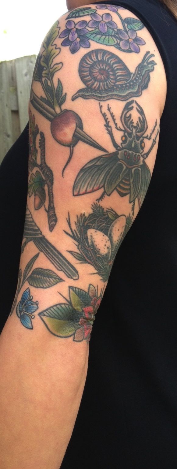
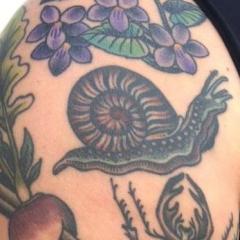
I'm with pretty much with @Graeme on this too. I'd never planned to have any reference to my children in a tattoo, wasn't something that even occurred to me, but as it happens I ended up with one anyway. Amongst the reference I took in before we started my arm was a copy some old botanical type drawings of eggs and nests, they weren't meant to refer to anything in particular - I just like the images. So, a few sessions in he pulled out a stencil he'd drawn up of a nest with 2 eggs in, 'you have got two children, haven't you?' he says... Well, if he'd not said that I'd probably never have associated it with them. But he did and now I have a progeny centered tattoo, which is nice. No names though. - - - Updated - - - The only photo I can find is quite blurry and possibly not fully healed, here: reference: - - - Updated - - - uurg - curse of the massive photos. Sorry. This is maybe better. Maybe.
-
Sounds like you're looking for some kind of Trash Polka thing, is that right? I've no idea on that - it's not my thing at all. Sorry! This thread is a great read, will keep you busy until someone more helpful come along: What makes a good tattoo?
-
Hello and welcome @rufio ! What sort of style are you after? There are loads of good tattooists about here in NL, they're not all in Amsterdam.
-
This is my toad - I'd really like another too. - - - Updated - - - Rather fancy a newt too.
- 29 replies
-
- 13
-
-
Has anyone else been following @debyarian 's tattoo history takeover on instagram these last couple of days? It's been most interesting, here: Instagram