

HunteR.S
-
Posts
3 -
Joined
-
Last visited
-
Days Won
1
Content Type
Profiles
Forums
Blogs
Interviews
Gallery
Store
Events
Posts posted by HunteR.S
-
-
@Hogrider got what you're saying, the quotes are important for me but i do agree with changing it to dodge mistakes and blowouts,
so first of all, about finding the font, it is something that i spoke to my artist about, and he said that we would sit on it and find something that fits us both. And because I like to "do my homework" I am doing a bit of research beforehand
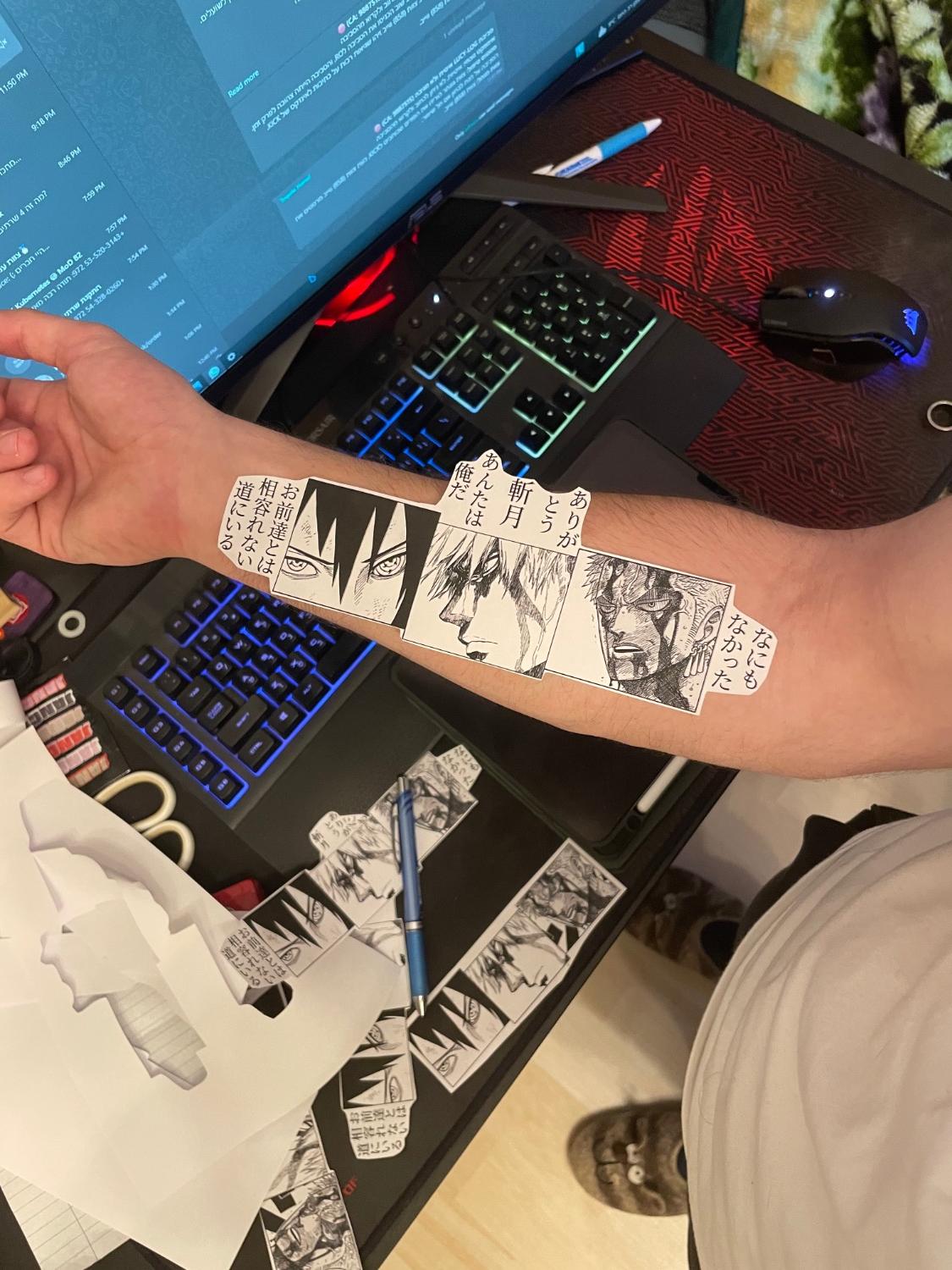
secondly, took to attention about the problematic areas, so what if I do something like this? (attached a new design), this way I have some more room for manipulation of size and position , as well as avoiding those wrist and elbow ditches
is this better?

-
Hi!
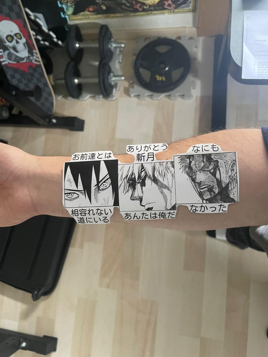
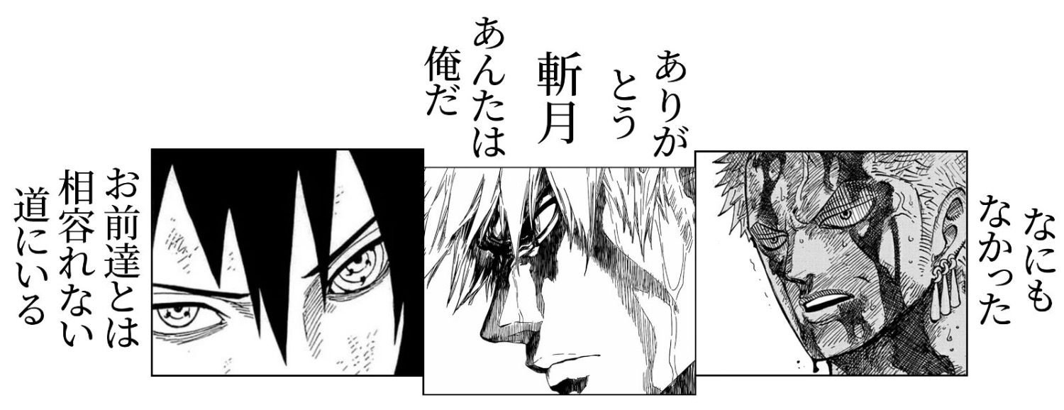
So I’m planning to tattoo this design I made on my forearm(as in the attached image-about 18x6 cm)
But something that I was wondering about was the font to use with the Japanese letters, as they are going to be quite small my tattoo artist advised me that we should find a font that’s less like brush strokes
so my question is if somebody has an idea for a font which would fit the overall theme but will not fade badly and will be more easily tattooed
Thanks
P.S I know that zoro and ichigos panels are not very good for a tattoo as the lines would fade to make it look incoherent, this is something I already talked to my tattoo artist about and he will design it better by hand


Japanese font in tattoo design
in Initiation
Posted
@Hogrider Here’s the end result!

I absolutely love it and love what my artist did to “spice” it up a bit